Customizing the Web Messenger
This guide covers all the ways you can customize the appearance and behavior of your web messenger. It walks through every setting in the bot editor, from top to bottom, starting with the root editor fields and then each of the grouped settings sections below them.
For a quick-start walkthrough of creating your first bot, see Creating a Web Messenger.
Basic Settings
When you open the bot editor, the first settings you see are the basic customization fields. These control the core identity and behavior of your messenger.

| Setting | Description |
|---|---|
| Name | A simple name to identify your bot if you have several of them, such as "Customer Support Bot" or "Jim". This is not shown to visitors. |
| Assistant | Connect an AI assistant to handle conversations using its configured personality and knowledge base. Leave set to (None) if you're using flows instead. |
| Intent Detector | If you have previously set up an intent detector (advanced), you can choose it here. Safe to ignore for most bots. |
| Title | The heading displayed at the top of the chat window. The default is "Let's Chat!" — change it to whatever fits your brand, like "Hi there!" or "Ask us anything", or if your bot has a persona, something like "Hi I'm Liza!". |
| Welcome Message | The first message visitors see when they open the chat. Write something friendly that sets expectations. Click the emoji button to add personality. |
| Welcome Choices | Clickable buttons below the welcome message that give visitors a quick way to start a conversation. Click + Add Choice to create them. Each choice has a Label (button text), Value (message sent when clicked), and Type (Quick Reply or URL). |
| Theme Color | Primary color for the header, user message bubbles, and widget chrome. Default is #6f5fe8. |
| Accent Color | Color for buttons, choices, and interactive elements. |
| Language | Default is Auto (detect from browser), which detects the visitor's browser language. Select a specific language to force the same UI language for all visitors. For translating custom text, see Internationalization and Translation. |
Below these fields, you'll see grouped settings sections — Header, Appearance, Widget & Launcher, Messages, Attention Getter, Features, and Privacy & Security — each with an Edit button that opens detailed settings.
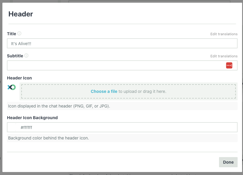
Header
The Header section controls what appears at the top of the chat window.
| Setting | Description |
|---|---|
| Title | The main heading in the chat header. Also editable from the root editor. Supports translations — click "Edit translations" to add localized versions. |
| Subtitle | Optional secondary text below the title. Supports translations. |
| Header Icon | A custom image displayed in the header (PNG, GIF, or JPG). Upload your logo or bot avatar here. |
| Header Icon Background | Background color behind the header icon. Enter a hex value or use the color picker. |
| Hide Header | Hide the header entirely. Useful when you want a minimal look. |
| Show Reset Button | Show a button in the header that lets visitors clear the conversation and start fresh. |
Appearance
The Appearance section controls colors, theming, attribution, the composer prompt, and custom CSS.

| Setting | Description | Default |
|---|---|---|
| Theme Color | Primary color for the header, user messages, and widget chrome. Also editable from the root editor. | #6f5fe8 |
| Accent Color | Color for buttons, choices, and interactive elements. Also editable from the root editor. | — |
| Background Color | Background color of the chat window. | — |
| Background Opacity | Opacity of the background, from 0 (transparent) to 100 (opaque). | 100 |
| Theme | Choose between Light, Dark, or Auto (follows the visitor's system preference). | — |
Attribution
On paid plans, you can customize or hide the "Powered by" attribution at the bottom of the chat.
| Setting | Description |
|---|---|
| Hide powered by attribution | Checkbox to remove the attribution entirely. |
| Attribution Text | Replace the default text with your own. |
| Attribution URL | Change the link the attribution points to. |
Composer Prompt
The Composer Prompt field lets you set custom placeholder text in the message input area. Supports translations — click "Edit translations" to add localized versions.
Custom CSS
For advanced styling, enter CSS directly into the Custom CSS field. This CSS is injected into the widget.
/* Example: Use a custom font */
.fxo-widget {
  --fxo-font-family: 'Inter', system-ui, sans-serif;
}
For the full reference of CSS variables, class selectors, and ready-to-use recipes, see Customizing with CSS.
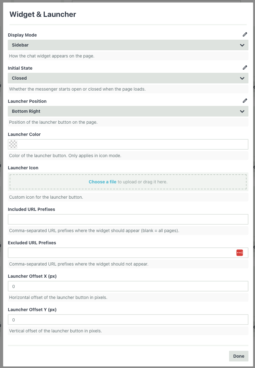
Widget & Launcher
The Widget & Launcher section controls how the messenger is displayed on your page and how the launcher button looks and behaves.
| Setting | Description | Default |
|---|---|---|
| Display Mode | How the chat widget appears on the page: Popup (floating widget in the corner, most common), Sidebar (persistent panel along one side), or Full Screen (takes over the entire viewport). | Popup |
| Widget Size | Size of the chat popup window: Small, Medium, Large, Extra Large, or Full Screen. Only appears in Popup mode. | Large |
| Initial State | Whether the messenger starts open or closed when the page loads. | Closed |
| Launcher Position | Where the launcher button appears — Bottom Left or Bottom Right. | Bottom Right |
| Launcher Color | Color of the floating launcher button. Only applies in icon mode. | — |
| Launcher Icon | Custom icon for the launcher button. Upload an image to replace the default icon. | — |
When you upload a Launcher Icon, additional settings appear:
| Setting | Description | Default |
|---|---|---|
| Launcher Icon Mode | Icon insets your custom icon (28x28px) inside a styled circular button with background color and shadow. Full uses your image as the entire launcher (60x60px, max 80x80px) with no background, padding, or shadow. | Icon |
| Launcher Close Icon | A separate image shown when the widget is open. In icon mode, falls back to a default X icon if not set. | — |
| Launcher Shape | Border radius in full mode — Circle (50%), Rounded (12px radius), or None (square). Only appears in Full mode. | Circle |
URL Filtering
Control which pages the widget appears on:
| Setting | Description |
|---|---|
| Included URL Prefixes | Comma-separated list of URL prefixes where the widget should appear. Leave blank to show on all pages. |
| Excluded URL Prefixes | Comma-separated list of URL prefixes where the widget should not appear. |
Examples:
| Goal | Included | Excluded |
|---|---|---|
| Show everywhere | (blank) | (blank) |
| Only on /help pages | https://example.com/help |
(blank) |
| Everywhere except /checkout | (blank) | https://example.com/checkout |
Launcher Offsets
| Setting | Description | Default |
|---|---|---|
| Launcher Offset X (px) | Horizontal offset of the launcher button in pixels. | 0 |
| Launcher Offset Y (px) | Vertical offset of the launcher button in pixels. | 0 |
Use offsets when you need to avoid overlapping with other elements on your page (like a cookie banner or another chat widget).
Messages
The Messages section controls avatars and bubble colors for each message role.
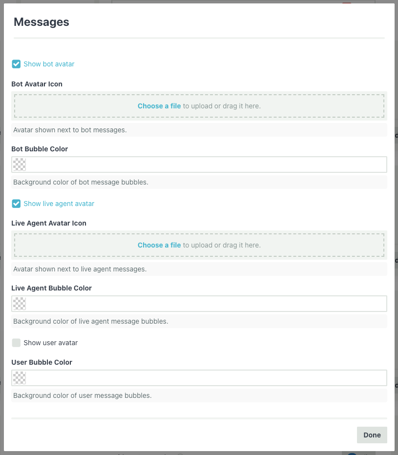
Bot Messages
| Setting | Description |
|---|---|
| Show bot avatar | Toggle the bot avatar on or off. |
| Bot Avatar Icon | Custom image shown next to bot messages. |
| Bot Bubble Color | Background color of bot message bubbles. |
Live Agent Messages
| Setting | Description |
|---|---|
| Show live agent avatar | Toggle the live agent avatar on or off. |
| Live Agent Avatar Icon | Custom image shown next to live agent messages. |
| Live Agent Bubble Color | Background color of live agent message bubbles. |
User Messages
| Setting | Description | Default |
|---|---|---|
| Show user avatar | Toggle the user avatar on or off. | Off |
| User Avatar Icon | Custom image shown next to user messages. | — |
| User Bubble Color | Background color of user message bubbles. | — |
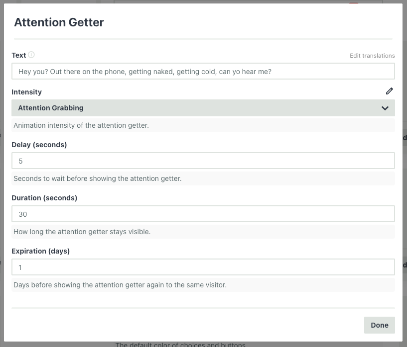
Attention Getter
The Attention Getter is a notification that appears alongside the widget to encourage visitors to start a conversation.
| Setting | Description | Default |
|---|---|---|
| Text | The message shown to attract visitors. Supports translations — click "Edit translations" to add localized versions. | — |
| Intensity | Animation level: Subtle, Moderate, or Attention Grabbing. | Moderate |
| Delay (seconds) | Seconds to wait before showing the attention getter. | 5 |
| Duration (seconds) | How long the attention getter stays visible. | 30 |
| Expiration (days) | Days before showing it again to the same visitor. | 1 |
| Play Sound | Play a notification sound when the attention getter appears. | Off |
| Sound URL | URL to a custom sound file for the attention getter. | — |
Example: Set the text to "Have a question? We're here to help!" with a 10-second delay and moderate intensity to gently prompt visitors without being intrusive.
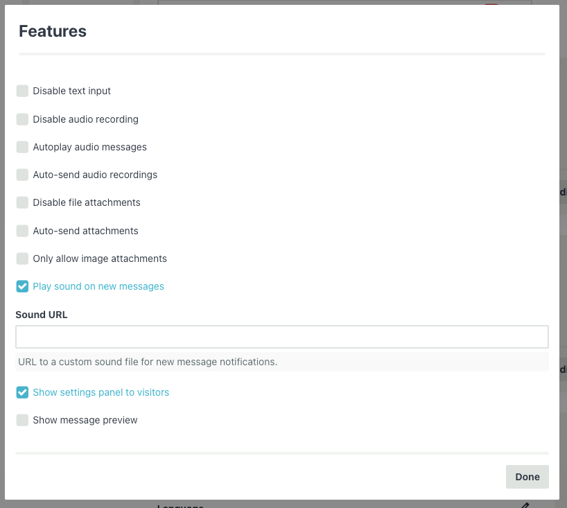
Features
The Features section controls the composer input, attachment handling, sounds, and other behavioral settings.
Composer
| Setting | Description | Default |
|---|---|---|
| Disable text input | Remove the text input entirely (useful for button-only bots). | Off |
| Disable audio recording | Remove the audio recording button. | Off |
| Autoplay audio messages | Automatically play audio messages from the bot. | Off |
| Auto-send audio recordings | Send recordings immediately without a confirmation step. | Off |
Attachments
| Setting | Description | Default |
|---|---|---|
| Disable file attachments | Remove the attachment button. | Off |
| Auto-send attachments | Send files immediately without confirmation. | Off |
| Only allow image attachments | Restrict uploads to image files only. | Off |
Notifications & Other
| Setting | Description | Default |
|---|---|---|
| Play sound on new messages | Audible notification when a new message arrives. | On |
| Sound URL | URL to a custom notification sound file. | — |
| Show settings panel to visitors | Let visitors access a settings panel. | On |
| Show message preview | Show a preview of incoming messages outside the chat window. | Off |
Privacy & Security
The Privacy & Security section controls data collection, conversation persistence, and domain restrictions.
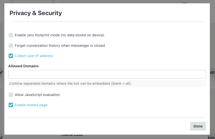
Privacy
| Setting | Description | Default |
|---|---|---|
| Enable zero footprint mode | No data is stored on the visitor's device at all. Conversation starts fresh every time. | Off |
| Forget conversation history | Clear the conversation when the messenger is closed. Hidden when zero footprint is on. | Off |
| Collect user IP address | Record the visitor's IP address. Hidden when zero footprint is on. | On |
Zero footprint mode is useful for kiosks, shared computers, avoiding GDPR requirements, or any scenario where you don't want conversation data persisting on the device.
Security
| Setting | Description | Default |
|---|---|---|
| Allowed Domains | Comma-separated list of domains where the bot can be embedded. Leave blank to allow all. | — |
| Allow JavaScript evaluation | Enable JavaScript eval in the widget (advanced). | Off |
| Enable hosted page | Whether to enable the shareable hosted chat page. | On |
Allowed domains is an important security feature. If you set this, the widget will refuse to load on any domain not in the list, preventing unauthorized sites from embedding your bot.
Example: example.com, app.example.com, staging.example.com
Next Steps
- Customizing with CSS — CSS variables, class selectors, and advanced styling recipes
- Installation & Embedding Options — Learn about all the ways to deploy the messenger
- JavaScript API — Control the messenger programmatically
- Using Metadata — Identify users, pass custom data, and collect visitor information
- Internationalization and Translation — Support multiple languages