Integrating the web messenger into your website or app
There are three ways to deploy your web messenger: as a floating widget, as a hosted page, or embedded inline within your content. This guide covers all three, plus tips for controlling where and how the messenger appears.
Option 1: Floating Widget (Recommended)
The most common approach. A small launcher button appears in the corner of your page. Visitors click it to open the chat popup.
Basic Installation
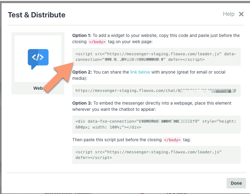
Copy this snippet and paste it just before the closing </body> tag on every page where you want the messenger:
<script src="https://messenger.flowxo.com/loader.js"
        data-connection="YOUR_CONNECTION_TOKEN"
        defer></script>
Replace YOUR_CONNECTION_TOKEN with your bot's connection token (found on the Authorize tab in your bot settings).
The defer attribute ensures the script loads without blocking your page content.
WordPress
If your site runs on WordPress, add the script to your theme's footer:
- Go to Appearance > Theme Editor (or use your theme's custom code section).
- Open
footer.php. - Paste the script just before
</body>. - Save.
Alternatively, use a plugin like "Insert Headers and Footers" to add the code without editing theme files.
Single-Page Apps (React, Vue, Angular, etc.)
For SPAs, add the script tag to your index.html file. The messenger will persist across route changes automatically.
<!-- public/index.html or index.html -->
<body>
  <div id="app"></div>

  <script src="https://messenger.flowxo.com/loader.js"
          data-connection="YOUR_CONNECTION_TOKEN"
          defer></script>
</body>
Google Tag Manager
You can also deploy the messenger via Google Tag Manager:
- Create a new Custom HTML tag.
- Paste the script code.
- Set the trigger to All Pages (or specific pages as needed).
- Publish your container.
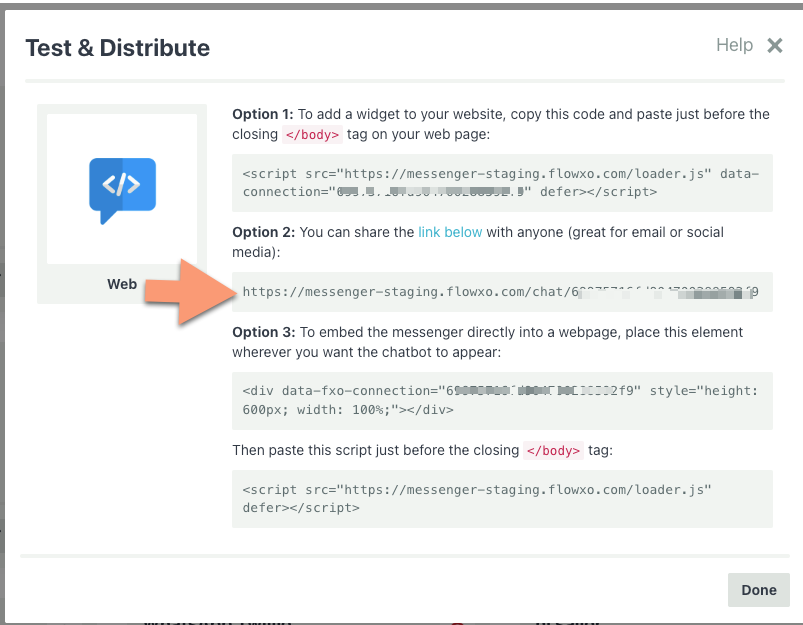
Option 2: Hosted Page
Every web messenger has a hosted chat page — a standalone URL that opens the messenger full-screen. This is perfect for sharing in emails, social media posts, or QR codes.
Your hosted page URL:
https://messenger.flowxo.com/chat/YOUR_CONNECTION_TOKEN
You can find the exact URL on the Authorize tab.
Use cases:
- Link from email signatures: "Chat with us live"
- QR codes on printed materials
- Social media bio links
- Customer support links in tickets
You can disable the hosted page in Privacy & Security > Enable hosted page if you don't want it publicly accessible.
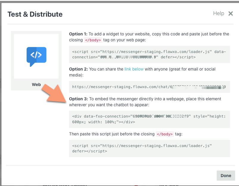
Option 3: Inline Embed
Embed the messenger directly into your page content, like a contact form. The chat appears in a fixed area rather than as a floating popup.
Step 1: Add the container
Place this <div> wherever you want the messenger to appear:
<div data-fxo-connection="YOUR_CONNECTION_TOKEN"
     style="height: 600px; width: 100%;"></div>
Adjust the height and width to fit your layout. The messenger will fill the container.
Step 2: Add the script
Paste this just before the closing </body> tag (if you haven't already added it for the widget):
<script src="https://messenger.flowxo.com/loader.js" defer></script>
Note that when using inline mode, the script tag does not include a data-connection attribute — the connection is specified on the container div instead.
Example: Full-page chat
<!DOCTYPE html>
<html>
<head>
  <title>Chat with Us</title>
  <style>
    body { margin: 0; padding: 0; }
    .chat-wrapper { height: 100vh; width: 100%; }
  </style>
</head>
<body>
  <div class="chat-wrapper"
       data-fxo-connection="YOUR_CONNECTION_TOKEN"></div>

  <script src="https://messenger.flowxo.com/loader.js" defer></script>
</body>
</html>
Example: Embedded in a support page
<div class="support-page">
  <h1>Need Help?</h1>
  <p>Chat with our assistant below, or email us at support@example.com.</p>

  <div data-fxo-connection="YOUR_CONNECTION_TOKEN"
       style="height: 500px; width: 100%; border: 1px solid #e0e0e0; border-radius: 8px; overflow: hidden;"></div>
</div>

<script src="https://messenger.flowxo.com/loader.js" defer></script>
Controlling Where the Widget Appears
URL Filtering
If you're using the floating widget and want to control which pages it appears on, configure URL filtering in the Widget & Launcher settings:
- Included URL Prefixes — Only show the widget on pages whose URL starts with one of these prefixes.
- Excluded URL Prefixes — Hide the widget on pages whose URL starts with one of these prefixes.
Examples:
Show only on help pages:
Included: https://example.com/help
Show everywhere except checkout:
Excluded: https://example.com/checkout, https://example.com/cart
Domain Restrictions
For security, you can restrict which domains are allowed to load your messenger. Set Allowed Domains in Privacy & Security settings:
example.com, app.example.com
If someone tries to embed your messenger on an unauthorized domain, it won't load.
Display Modes
The Display Mode setting (in the Widget & Launcher settings) controls how the messenger appears:
| Mode | Behavior |
|---|---|
| Popup | Floating launcher button that opens a chat popup. Best for most sites. |
| Sidebar | A persistent panel along one side of the page. Good for support-focused pages. |
| Full Screen | The messenger takes over the entire viewport. Best for dedicated chat pages. |
In Popup mode, a Widget Size setting also appears (Small, Medium, Large, Extra Large, or Full Screen) to control the popup dimensions.
An Initial State setting controls whether the messenger starts open or closed when the page loads. The default is Closed — set it to Open if you want the chat to appear immediately.
Launcher Positioning
Fine-tune the floating launcher button:
| Setting | Options |
|---|---|
| Position | Bottom Left or Bottom Right |
| Offset X | Horizontal offset in pixels (e.g., 20 to push it away from the edge) |
| Offset Y | Vertical offset in pixels (e.g., 80 to clear a cookie banner) |
| Launcher Color | Custom color for the button (icon mode only) |
| Launcher Icon | Custom icon image |
Custom Launcher Images
You can fully replace the default launcher with your own image. Upload a Launcher Icon in the Widget & Launcher settings, and two additional options appear:
- Launcher Icon Mode — Choose between Icon (your image inset in a styled button with color and shadow) or Full (your image is the launcher — no background, padding, or shadow).
- Launcher Close Icon — An optional separate image shown when the widget is open.
In Full mode, you also get a Launcher Shape setting (Circle, Rounded, or None) to control the border radius. This is ideal for fully branded launcher designs where you want complete control over appearance.
For more details on all launcher settings, see Customizing the Web Messenger — Launcher Settings.
Next Steps
- Customizing the Web Messenger — Colors, themes, avatars, and more
- JavaScript API — Programmatically open, close, and configure the messenger
- Using Metadata — Pass user data and custom metadata via data attributes, global config, or the API
- Internationalization and Translation — Support visitors in multiple languages